2Crafty Chipboard September inspiration

Hello peeps. I've been a little bit quiet on the blogging front recently due to my two week holiday!!! But I'm here now to share with you my September inspiration using some yummy 2Crafty Chipboard.

 It's spring here in Australia and I am so looking forward to the weather warming up!
The first of my three layouts this month is a bright and colourful creation.

"Precious Friends"


2Crafty products used
"Circular Panel"
"Friend Card Word"
"Assorted Arrows"
"Precious - Loopy Font"
"View Finder"

This was such a fun layout to create. The picture is my crazy son and his best buddy on their last day of high school (Muck Up Day). I wanted the layout to be bright and fun with a little crazy and a lot of boy about it. Not asking too much?


I started by powder/heat embossing the "Circular Panel" which I segregated to share through out the page. I used the amazing "Metallic Melts" from Tinby Designs.

I added the small "View Finder" after I'd sprayed it with colour sprays.


The title words both "Loopy Font Precious" and "Friend Card Word - Friends" I covered with black ink and then placed a layer of gloss dimensions on top and waited for it to dry. I used the same technique with the little black arrow sitting on the "View Finder" from the "Assorted Arrows" set.


My second layout is a bit cute! It's a photo of my mums puppy Molly that we bought for her. This little friend is such a cute and smart little thing. I've wanted to scrap her photo for some time now.

"This Sweet Treasure"


2Crafty products used
"Film Strip Medium"
"Friend Card Word"
"Chevron Bits"


The "Film Strips - Medium" I painted with black Gesso and backed with some old book pages. I cut it in half and placed it under my photo.


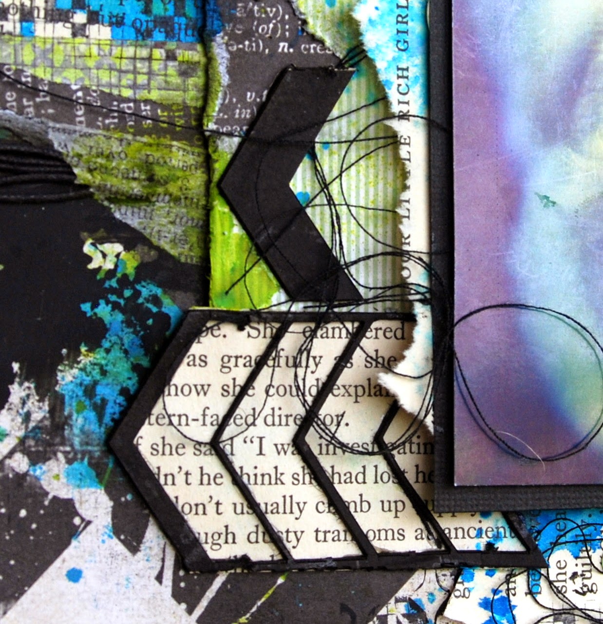
The "Chevron Bits" were treated the same way including the frame in which the chevrons are cased in. I love to use every little bit of  2Crafty Chipboard that I can.


The words in the title Sweet Treasure, came from the "Friend Word Card". I love these little word cards. You can use just one word from them or, like I've done here, you can combine two or three together to make a whole title. I painted them with white Gesso and then used watercolours to tint them slightly. I've used the "Nature Walk" paper from 7 Dots studio. I've recently purchased these (I know, a bit slow off the mark) and I LOVE them all! But the chevron one is my favourite by far.

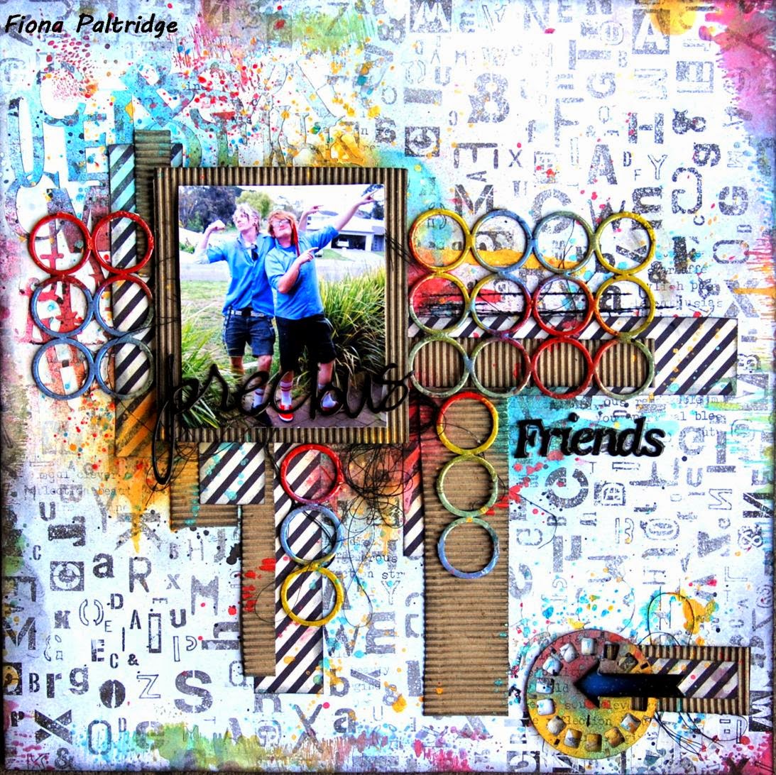
My final layout out is my favourite of the three. It is my Sister and brother in-law. I love this photo because it shows my sister as her true nutty self!

"Today"


2Crafty products used
"Circle Revolution Frames"
"ATC Hearts and Stars"
"Today - Loopy Font"


I painted the "Revolution Frame" with black Gesso and when it was dry, I ran my white ink pen roughly around it to give it a sketched look. The background piece is one of my favourite papers from Kaisercraft.


Five stars in total from the "ATC Hearts and Stars" card are included on the layout. Each one is coated in white modelling paste and left to dry, giving them a rough textured finish.


The "Today - Loopy Font" word I painted with yellow acrylic paint to tie in with the background. It starts off my quote from Dr Seuss "Today you are you, that is truer than true". There is more to that quote but I didn't want to detract from the yellow "Today - Loopy Font" and it said what I wanted it to say. I've hand written it and I'm not overly happy with the end result but overall it works and I shouldn't be so bloody fussy LOL!


So that's me for 2Crafty Chipboard for the month. I can't believe how quickly the year is going.........

 And remember, to find a 2Crafty stockist near you, drop an email to...
salesat2crafty@optusnet.com.au

SATW September challenge

Hi all.
I've been on holidays and so I've not really had a chance to scrap for "leisure" so to speak. I have lots of DT commitments, don't get me wrong, I love them, which is why I said for "leisure" and not for "fun" because no matter if they are DT or not they are fun. I haven't had a chance to enter any challenges this month and so I checked out my favourite challenge blogs and Scrap Around the World enticed me as they always do :)

Here is their magical moodboard designed by Amy Voorthuis. The old books caught my eye IMMEDIATELY!


Look closely at the pink one ............ 

There was my inspiration. My favourite childhood story in a moodboard. Who could ask for anything more?

I was so excited!!!

But ........... before I reveal the finished product I have to share with you how it came about........


To begin with, I created an absolute disaster ........ A dark mass of no direction and nothing good was coming of it. So I did what I should do more often ...... I ripped the bits off and started again!!! 

As I slowly rubbed and peeled the black paper layer off ......... I discovered that low and behold, I had actually created a transfer from the patterned paper (opposite side) onto the canvas and it looked AWESOME!

Curiouser and curiouser!

So now with my background pretty much already done, I could move onto the embellishing.


I wanted to incorporate my favourite elements of the story into the canvas.The shrinking and growing of Alice, in my childhood imagination was the most fascinating thing ever. So that was a must.


I decorated a little chipboard cupcake and a little glass bottle to represent the "Eat Me" and "Drink Me" part of Alice's' transformation.


I also wanted to incorporate the Mad Hatters Tea Party. This I did by adding a chipboard teapot stamped with a lace stamp and a little silver teapot charm.


The key and the lock were to represent Alice's journey through the little door and lots of clocks because we don't want to be late for that very important date!


And of course Alice. Here I had a little trinket I'd made for a necklace a while ago with a picture of Alice. It is one of the drawings from the original story book. I also added a little gingham bow.


In the bottom right hand corner I added a fob watch for the rabbit. This is a little trinket I had made also for an Alice themed necklace. it fitted in perfectly.


I finished it off by writing a prose from the book from which Alice was reading when her adventure began.
Even though this began with disaster it ended in true magic and I love it.

Not my usual thing to do but I think my confidence is growing when it comes to creating canvas art like this.

Cheers
Fiona xx


A tutorial for Off The Rails

Hello everyone. Can you believe it's almost the end of September!

I have a little share for you today. An art journal page I created using some inexpensive products. These paints can be found in $2 shops and even sometimes in supermarkets. I used to buy them for my daughter to take when we went camping as part of her "Art" kit.

Now that my daughter is all grown up, and her
"Art" kit now consists of multi core's, RAM, processors and motherboards (far more expensive than a little pot of paints)!! I haven't really had these little gems around the house.

However the lovely blog owner over at Off the Rails Scrapbooking. Amanda, sent me some a little while back and asked me to see what I could create with them. 

You can find Amanda's goodies HERE

These are little pots of acrylic paint with a satin finish that are affordable and easy to use. They are water based and so react with water really well making them ideal for creating colour on your layouts as a background or adding colour to an art journal page similar to what I have done.


I started the journal page by covering the pages in white gesso. Then I went crazy with some stamping. I used Jet Black Stazon Ink because I wanted the stamping to stand out and I wanted it to be water resistant. This is important because I'll be adding lots of water and paint over the top.

I then added some "Rug gripper". It's a mesh type of tape that is sticky both sides. It gives some great texture to your page as well as acting as a sort of sticky tape for the paper I wanted to put over the top.


Next step was to glue on strips of scrap patterned paper. I chose to go with black and white prints so they wouldn't detract from the colours I would be adding over the top.


After spraying some water over the page, I added the coloured paints randomly over the pieces of patterned paper. I just kept adding paint and water until the colours combined a little and then let it dry.


After it was completely dry, I smudged some white gesso over the top in some places. This was to help the colours and papers blend together. It creates a soft appearance. If you prefer the clean edge look you could skip this part.


I splattered some black and white watered down paint over the whole area and again waited for it to dry. Right at the end, once the whole page was dry, I drew some lines of definition around the patterned paper and traced over some elements of the stamping with a black fine tip pen. 

I wanted to add some depth to the page and the addition of the black drawing achieved this perfectly. Tracing over stamping is so easy especially if you're like me and couldn't draw anything to save yourself! All the hard work is done for you :)


This was a very quick and easy journal page to create. I think I might even use this techniques to create a layout background for my scrapbooking too!

Cheers for now xx

Guest Designer for Limor Webber Designs

I must start this post by firstly saying AAAAAAHHHHHHHHH and then WOW! And then follow that up with REALLY? Little old me???
Yes, I can now announce that I, (little old me!) have been asked by Limor, yep the real Limor Webber from Limor Webber Designs to be a part of her amazing new design team as a Guest Designer.
BREATHE, BREATHE. BREATHE FIONA, BREATHE!
Now I know that for any normal person, this may seem a bit over the top but man......... I'm excited! !
I am truly gobsmacked this fortune and opportunity has come my way. What an honour and a privilege it us to be a part of this amazingly talented team.
I can't wait to see what everyone creates and share with you all the fabulous products Limor Webber Designs feature.

Off the Rails Scrapbooking Tutorial for September

Hello everyone. Well it's my time over on the Off the Rails blog today and I'm sharing with you a process video I've made recently of a double spread page called "Be Creative".


I created this art journal page as a reminder to BE CREATIVE. Too often we doubt out ability to create when in actual fact we always have that ability. Through the process of creating something we ARE being creative. I often doubt myself and judge harshly each and every creation I make.


So I made this page to remind myself that no matter what else I think, I am creative! As long as I like it and I've learnt something from it, it's worth it.


A friend of mine recently posted a quote about comparing your art to others and that the only persons art you should compare with is your own. I loved it and I think it's a really important message for all of us.


Off The Rails September Challenge

OH My gosh! I can't believe it's September already!!! Seriously where has this year gone??? I just can't seem to fathom, that I'm posting challenge DT inspiration for SEPTEMBER. It'll be Christmas before we know it!

Over at Off the Rails, we have another awesome challenge with a mood palette. This is what I created.


And here is the mood palette.


My layout is of Luna Park in Sydney. A place where you can free yourself from all the worries of the world,  relax and have fun! It also has a carnival feel about it like the feathered mask in the mood palette.


The background paper is from 13@rts designed by Aida and is "Good Times" from the Timeless collection. Very appropriate I feel. It has a beautiful blueish grey tone to it. Perfect for the colour palette.


I added some coordinating water colours to the background, along with some modelling paste through a TCW stencil "Spinning Tops". I also added some plumbers tape or grid tape (I'm not sure what to call it) and some hints of gold drawing ink.


I combined some of the elements from the coordinating "All the Time" paper from the same Timeless collection. I've also added some cotton for texture and a piece of plastic netting that I had stashed away. I think it was a bag that held one of those shower scrubber thingies and a piece of soap as a gift. I use it to clean my stencils and just happened to keep the plastic netting bag it came in.


So there is a use for what seems like a very usless item. The bag that is, not the scrubby thingy. They are useful for all sorts of things!

Rambling now...... so I'll finish up. :)

Cheers xxx


Can I Do that??? Catie's Challenge

You all know I love a good challenge! and this one was no exception. Catie Kennedy has created an awesome challenge group called Can I DO That?. It's a challenge sight just for fun, no prizes, no accolades just a great place to stretch your creative rubber band!


The rules were "to create a page with plain white (or kraft) background - no paint, mists, gesso, texture paste, splatters of any of those ..... just plain! You can layer pieces of patterned paper under your pic/s but you can not use a piece of pp as your background. you can use whichever embellies you like, but there is no decorating or embellishing the background cardstock."


YEP!!! nothing!!! WHAT??? how was I going to do that? Well I did. It planned and thought about it for ages. I asked myself "How will I gain texture without texture paste?", "How will I add contrast without inks?".


So I gathered up everything I thought I might use and headed off to "Inspiration Day" with Pam Kuhn from Kaszazz. I figured I'd procrastinated long enough!


I ended up really loving this process. And by the time I got half way through it I found I had stopped reaching for the MM products. The biggest difference I noticed was not having to wait for drying! I hadn't realised how frustrating this was. I might have to do more of this style for my "quick grabs" that I find myself doing occasionally (usually due to not being organised and having deadlines to meet lol)


This is a photo of my beautiful daughter with her childhood friend "Mr Kittens". She went off to Uni this year and I miss her dearly. By the looks of this selfie she posted the other day, she misses us too ;) Mr Kittens was always her go to friend when she was a bit sad.

I've also noticed my camera has a dirt spot on it. I've cleaned it but it keeps appearing. It must be deeper inside the camera, so I'll have to send it off to get a good clean out I think.

Thanks for popping by. I hope you like my challenge page and I've inspired you to give it a go.

Cheers
Fiona xx


Scrap it With Attitude September Challenge

September, September, September. Why are you here already???
Concerning isn't it?

Well a new month, means a new challenge over at Scrap it With Attitude and this month the theme is Die Cuts. I work for a chipboard company (2Crafty Chipboard) so I don't do much in the way of die cuts. But I do have them ...... I have a fair few actually and the lovely Beck BT over at Scrappy Chat Designs often encourages me to use Spellbinders dies in the kits I design for her, which is exactly where these dies came from. (Thank you B. BT!xx)


I decided to create a journal page for my inspiration this time. I love to use journalling as a way of practising techniques. To create the background I cut out a set of Spellbinders "Pierced Circles" 


and used them as a mask over the background placing them down randomly and spraying with one colour, moving them around and spraying them with another colour and so on until I'd covered the whole page. I kept the two bigger ones clean to form my Dream Catcher circle. Once the background was dry, I added blended Black Soot Distress ink through the TCW "Spinning Tops" stencil. 
Next I cut 4 sets of the "Feathers on the Wind" and coloured them with water colour pencils.


Once I added the water they softened up and the colours blended together beautifully. I hung them from the circles with black cotton and wrapped some more cotton around the circles giving it a dream catcher look.


I also stamped some feathers onto the background behind the die cut feathers. These ones are my favourite feather stamps. They come from Kaszazz. I finished the page off with a die cut word "Today" from TCW and some chippies to say the word "Dream". See had to get some chippies in there somewhere LOL!


I love the bright colours from the Dylusions Ink Sprays and how they contrast with the white on the page. This was such a quick and easy journal page. The fiddly but was stringing the cotton through the circles but the effect is definitely worth it.

Why not pop on over and see the other DesignTteam members inspirations as well and you might even like to enter the challenge. The Facebook link is HERE.

Cheers xxx