An Art Journal piece for VLVS!

Hello. Today I'm here with you to share a little art journal spread I created using the fabuloso! Viva Las Vegastamps!


This is a little art journal I like to play in with my stamps. It is never very dimensional bat rather the layers are all about the colours I can combine. This time I wanted to play around with adding a little bit of fluro pink to my art. 


 And playing with Cat Kerr's new stamps!! I am totally in love with this plate she has created.


I had it in my mind that it was a bit vintage orientated to begin with but once I got it out and started playing with it I soon realised how versatile the designs were.

I ended up with a real hipster/whimsical creation in the end and I really love it!


I will definitely be incorporating these stamps into more of my work in months to come!

Viva Las Vegastamps! used:


Thanks for popping by xx

The Sustainable Souls Project - January - We Are All Connected

Welcome to The Sustainable Souls Project 2017. I am very proud and humble to be joining this talented team of arty chics who are passionate as much about art as they are the environment.


And so we kick off with the most amazing of themes .....


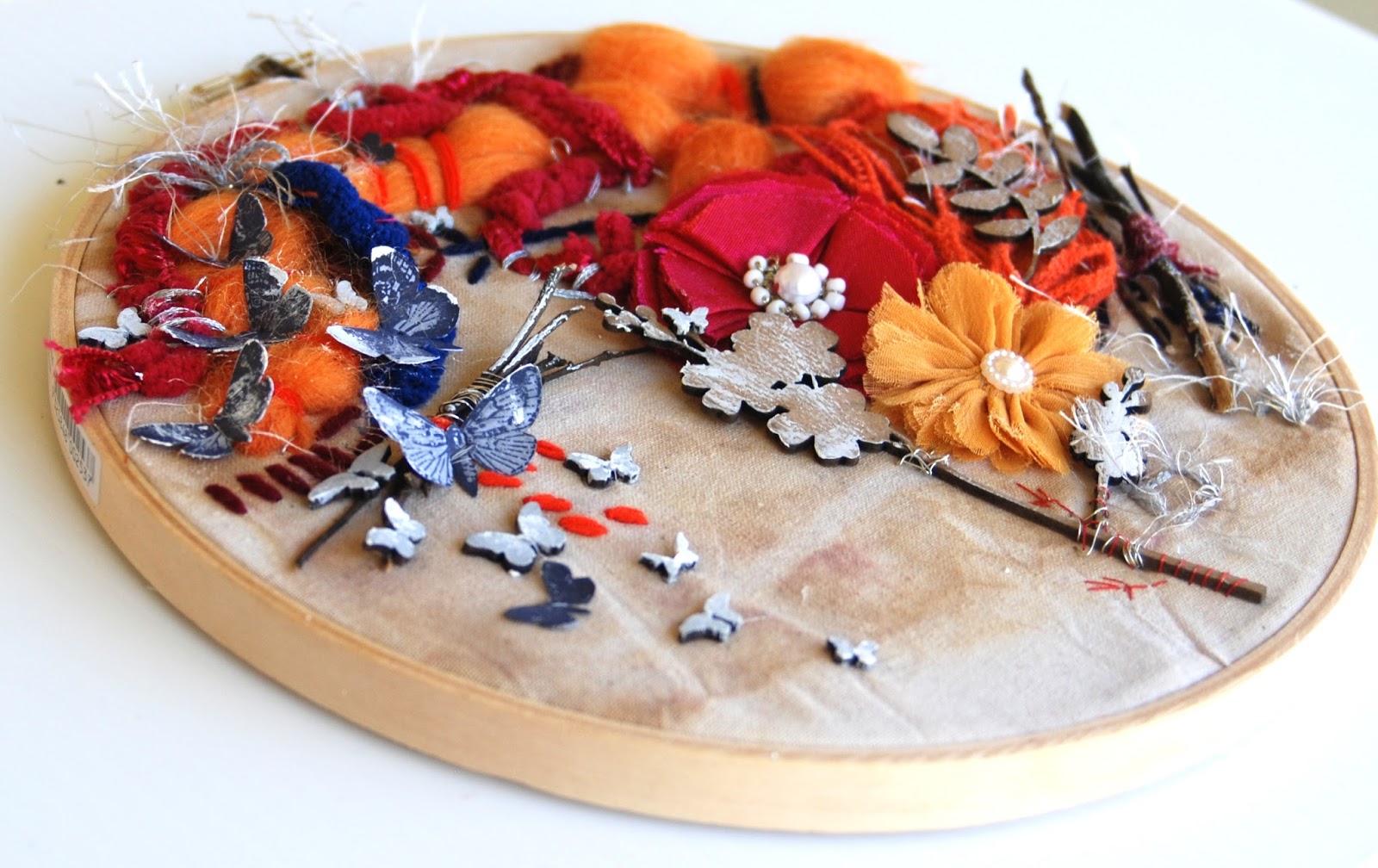
My project was inspired by connected-ness in both a metaphorical way and a physical way. So my project has both a physical connection with the way every little segment touches the other and a metaphorical way where I've incorporated little bits that connect me to the world.


Not every little segment has a significant connection to me but there are some elements that I have specifically added. The denim "Sweet to the core" embroidery is from an old, very well loved, pair of Apple Bottom Jeans that I had to order especially from the US. This is my connection to all the gorgeous souls I now know through my art who live in that country.


The word "Care" in the little light bulb represents both my connection with my day job as an early years educator and the connection and care I feel with the environment.


The little arrow is to make sure we continue to point ourselves in the right direction. 

The little glass bottle is to remind us that the earth is so fragile and can be broken easily.

The orange piece of bailing twine wrapped around the raw twig sitting a top a gum leaf is a representation of my connection to my country and a regional farming life.

The pencil represents so many connections. To my Grandma, my mum and my daughter who are all beautiful sketchers and painters but it also is a metaphor for making mistakes. If only we would write the story of the planet in pencil, then we could always go back and rub out the bits we got wrong. Maybe I should have had a permanent marker lying next to it to remind us of the irreversible damage we have and still are doing to our planet.


If you would like to create with us this year, please feel free to use our monthly theme as inspiration. We would love to see what you create!  

If you can't create but would like to support and participate in our quest for a Sustainable future, please feel free to grab our badge and share it on your social media sites. We truly appreciate your support and understanding that our future must change for our children and planet earth.

Thank you for popping by xxx

"Compose Your Life" a layout for 13Arts


Hello. I'm here with you today to share a pretty layout I have created using the Aria Story collection from 13@rts.


I am really enjoying using the gorgeous yellow papers from this collection and I wanted to experiment with adding some extra colours to my layouts that will compliment the yellow.


This time I decided to add the blue and silver to compliment my photo.


I painted the gorgeous flowers off of the A6 cards with the METALLIC! paints in both yellow and blue and mixed them together a little to make some green hues as well.


The page is complimented by adding black splats and black stenciling using the black gesso.


I also added some black stamping along with some blue and yellow SPLASH! ink splats to the background.


I coloured the title using the SPLASH! Inks also and made sure I mixed them in the centre of the title to create a blended effect.

Yellow is such a versatile colour to pair up with. Next time I think I might try pink or maybe orange....... 


13@rts products used:

Thank you for popping in to see my creation. I'll see you all again very soon. xx


Art Journal Page for 7 Dots Studio


Hello everyone ...I'm here with you today to share an art journal spread I have created using the "Writer's Block" collection fro 7 Dots Studio.


I love the vintage black and browns in this collection and I wanted to see if I could make a grungy art journal page with them.


I began by layering some of the tags on the background across the centre of the page and on the inclusion piece in the middle. 

 I sprayed some black ink through the Letters stencil over the top of the tags and then added some white gesso .... I was really liking what I saw!


Of course I have to add some old book pages! They marry up so perfectly with this collection.


To finish it off I simply added my favourite Element stickers, die cuts and some words from the sticker collection. I was really happy with the grungy old style look this page has taken on.


7 Dots Studio products:


Thank you for popping in to check it out. I'll see you again soon xx

GUEST Over at Our Mixed Media Moods


Hello lovely people. I am so honoured to be asked to guest for DeeDee and Jen over at Our Mixed media Moods. 

The mood board grabbed me the instant I saw it. Those colours!!! MAN they are so yummy.

I've always had a thing for orange and magenta together. I knew exactly what I wanted to do with it!


I have a girl crush on the amazingly talented Lisa Pate at the moment. I'm so excited because I get to meet her soon at a retreat I'm going to in the Hunter Valley. Any way ..... she is an absolute STAR with weave and texture and paint and drawing and embroidery. Go check her out HERE.


And so I created this little gem based on one of her beautiful pieces I spotted on Instagram a couple of months ago. I've given it a Fiona twist and added some mixed media to it.


At first I wasn't too sure about it .... you'll see hear what I think of it in the video LOL but it all came together really well in the end. Now it's one of my favourite pieces.


I really enjoyed the latter part of the making ....... I seriously don't work well with a needle and thread ..... but I tried really hard and I did get better towards the end.


I ended up cheating a little in the end and I did glue the little butterflies on but  ...... I also gave them all a little stitch so that they looked like they'd been stitched on. It's the thought that counts yeah?


You have to check out Jen and DeeDee's creations too!! They are amazeballs ... as always ..... here ar the links to their videos.


This month there is a prize on offer for joining us. Viva Las Vegastamps! are sponsoring the month with a $25 gift voucher ........ You can LINK UP HERE


And make sure you show us your stuff on our FaceBook page  HERE

You can watch my video below :)


Thanks for popping in xx

A Little Notebook for 13Arts

Hello my lovelies! I'm here with you today to share a little note book I have decorated for 13@rts.

I used the chipboard clock to create a sort of dream catcher.


The little book is sparkly and shiny thanks to lots of yummy micro beads and holographic glitter.


I also added my title "Dream & Believe" using the chipboard words and the little Cabochon and some paper "You and Me" to make the ampersand.


I really enjoy wotking with the Turquoise colours in the 13@rts range. This time I've teamed them up with the black gesso and I'm really happy with the results.

13@rts products used:

I hope you've enjoyed my creation. See you again very soon.

Art Journal Fix for VLVS!

Hello peeps, I'm here with you today to share a little video tutorial on "How I fixed my Art Journal" ...... yep fixed!

Long story. Anyway, it went really well. 


Viva Las Vegastamps used:

So sit back and enjoy the video.


A Little Card For Dusty Attic

Hello loveliness's! Fiona here with you to share my VERY FIRST Dusty creation!! Eeeeeekkkk a tad exciting!!! I'm just loving having a play with this gorgeous chippy and other products. So many possibilities!

I decided I'd make a little card inspired by this months mood board.


The blue tones in this board just spoke so much to me. I wanted to try out some of the Dusty In Colour to see how they applied. My intention was to make a weathered wood effect similar to what was in the moodboard. They were FABULOUS!! Great coverage, awesome colours and easy to apply from their little squeeze bottle. I am definitely a fan!


I also wanted to add some of the gorgeous Dusty in Bloom Collection. The Blue Bonnet flowers match in perfectly. I tweaked them ever so slightly with some Dusty in Colour Denim and some white Gesso.


And then of course there is the chipboard. The gorgeous blue winged feathers on the moodboard caught my eye immediately so I wanted to try and add that in some how. The perfect solution was to choose one of the Large Wings which I coated with different shades of blue, grey and white.


I also added a title or sentiment to my card from the Cherish Yesterday set. I wanted this card for a friend who is heading into new, exciting and big challenges in 2017 and I wanted her to remember that she is working hard for her future and so "Dream Tomorrow" was appropriate.


The background was created using one of The Dusty Attic stencils which I'm also totally in love with! These little 7"x5" stencils are so perfect for cards and this design suited the moodboard well.

The Dusty Attic Products Used:


That was so much fun! Thank you for sticking around and checking out my first post. I'll be back next month with some more creations for you xx