Bigger on the Inside!!!

Well ........ I have to say I did squeal a little bit when I finished this one!! Just a bit.

Bigger on the Inside


Chipboard pieces used
"Funky Arrows"
"Light Bulbs"
"Gears"
"Chevron Bits"

Now ...... don't laugh but ....... I am a massive Dr Who fan other wise known as a "Whovian"! (Yep they have a name for it LOL!!)
 And one of my favourite things about Dr Who is the T.A.R.D.I.S (Time and Relative Dimensions In Space). I received a Dr Who calendar (amongst many other very awesome Dr Who paraphernalia) for Christmas and on the back cover there was this picture (along with a few other iconic elements of the show) so I cut it out, because that's what scrappers do! and I created what I think is

THE MOST AWESOMEST PAGE EVER!!!

If I must say so my self.

I started with just white card stock. I wanted the colours of the T.A.R.D.I.S to be the main feature as it is an iconic blue. I just went "swoosh" with the paint brush in a circle (cause I love circles) and got a "Worp Drive - Worm Hole Refractor" image!! See ......

Like this!!


 Then I decided it needed a yellow sunburst but I don't own a sunburst stencil (add that to the list!) so I made one!


O.K. not the prettiest thing I've ever made but it worked all the same. I sprayed over the "Worp Drive - Worm Hole Refractor with some "Bonjour Butter" from the Lindy Stamp Gang "Tres Chic" Flat Fabio Spray Set and voilĂ  I had a sun burst! 


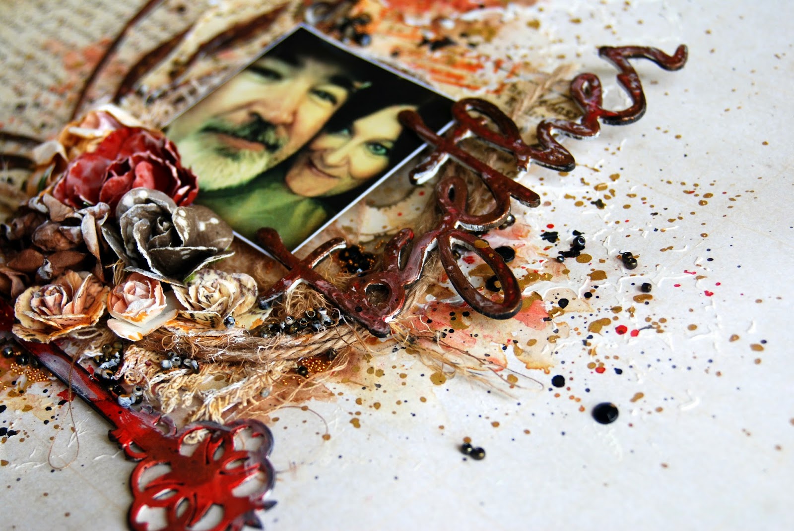
Getting just the right chipboard pieces was very important and I was a bit indecisive to begin with. I did however settle very quickly on using the "Gears" as a major element. I wanted to represent the mechanics of this beautiful time machine. I heat embossed them with silver Beck BT Tinby Designs Metallic Melts in the "Silver" which gave them the perfect finish.

Some stitching on the page along with some plumbers tape and mathematical washi tape, gave the whole layout a "T" shape over the worm hole!
The "Chevron Bits" also work brilliantly as they give the impression of movement on the page. I just stamped on the raw chipboard with my type writer stamp except for the first one which I painted black.


I added the "Light Bulb" that I painted yellow using Ayeeda's Vivid Paints from 13@rts. You can buy them from Sassy Scrapper here in Australia. They are highly pigmented and last forever because a little bit goes a long way! The light bulb often represents ideas or intellect and the T.A.R.D.I.S has both!


I finished up the page by adding some hand drawn stars, a few arrows and this famous line about time travel from the tenth Dr, David Tennant.


 So I'm going to leave you with my most favourite T.A.R.D.I.S moment ......

“He thought for a second, then spun to Clara.
 'Did you say something cruel to the TARDIS while I was getting changed?'
'No! Of course not!'
'Did you call her fat?'
'What?'
'Because she's not fat. She's just bigger on the inside.” 


xx
Fiona

My Second 2Crafty Chipboard Share for January

Hello again xx
My second project is an artistic interpretation of scrapbooking. Here I have applied some art journal techniques into my scrapping. I just love experimenting with colour and design.

"FRIENDS"


My second share for 2Crafty Chipboard is a colourful page I created of my sister and her best friend. They are both actors and this is my sister preparing for a production while her friend annoys her LOL! They are such good friends. So much fun to be around, they always brighten my day so hence the bright design.

Chipboard pieces used
"Circle Revolution"
"Circle Stack"
"Word Circles set 2"
"Chicken Barbed Wire Small"
"Circle Frames"
"Mini Cameras"
"Family Symbols"

Would you believe the background paper is meant to be for a sport page? Well it's called "First Place" and it"s from the Game On collection from Kaisercraft! I won it in a prize pack and never thought I'd ever use it but .... never say never! I've heavily coated it with clear gesso as I wanted to add lots of liquid to it (water colours etc) and it just wouldn't have held up if I didn't protect it first.


I do love circles! They are my favourite shape to work with and this big circle on the top and little circle on the bottom design would have to be my favourite. I've used both the "Circle Revolution" and the "Circle Stack" to create this affect.


In keeping with the circle theme, I've use the word friends from the "Word Circles Set 2". I simply painted it black as I wanted it to really stand out amongst all the colour. To add colour I've used not only water colour paints but also Limor Webber's Lindy Stamp Gang Flat Fabio Spray Set "Under the Boardwalk". These colours are so beautiful.


I also painted some "Chicken Barbed Wire Small" and added that. A hexagon is not really a circle shape but it's close so it works ok and also the background paper is patterned with hexagons.


The other circles from the "Circle Frames" are either painted and then layered with gesso, texture paste and or water colour paint or covered with old book paper (gotta get it in there somewhere!) as is the little guy from the "Family Symbols".


I also added one of the "Mini Cameras" just because I LOVE them! This one is painted with white gesso and then lightly washed over with water colour. It leaves a beautiful soft finish that blends with the circles.


This page was so much fun to make. Probably because it required mess!

Thanks for popping in to check out my mad creation. I'll be back tomorrow with another one!!
Cheers
Fiona

My First 2Crafty Chipboard Share for 2015

Helloooo my lovlies xx
I am here to show you my first 2Crafty Chipboard share for 2015. My first layout is a rare photo of me and him ;) that I managed to snap on Christmas day when his guard was down ... lol

"Together"

Chipboard pieces used
"Ariel's Spray"
"Together Loopy font word"
"Vintage Keys"

I designed the layout around the "Ariel's Spray" swirl. I have simply given it an undercoat of white gesso and then painted it with water colour brown paint to coordinate with my background paper. It also has some gold paint spaltters on it. I've used two pieces of paper to create the background. Both pieces are from the Kaisercraft range "Secret Bird Society". I've torn off a third of the "Undercover" piece and stuck it directly onto the piece of "Conceal". I know it's really old paper but I just love it.


My title is created by using the "Together - loopy Font" word which I have heat embossed with bronze Beck BT's Tinby Designs Metallic Melts in the "Copper" and then treated with a little bit of coordinating red water colour paint and finally some gesso to help it blend in softly to the design.


I've done a lot of water colour paint work underneath. You can see bits of it poking out every now and then along with some texture paste through a stencil.


I've added this beautiful key from the "Vintage Keys" set also under coated with white gesso and painted with water colour paint. This time in a coordinating red.


I also added lots of pretty Prima flowers, glass beads and some old lace. My favourite addition is this little rub on heart that I got as a Chrissy gift from the beautiful Jelissa. It's a little my minds eye rubon that came in the set she sent me.


Thanks for popping by. I'll have another one tomorrow for you xx
Fiona

My Masters Entries Up Close and Personal Tasks 3 and 4

As promised here are tasks 3 and 4 of the Scrapbooking Memories Masters challenge. As I was saying in my last post, I began this journey back in July 2014. I recieved a phone call one morning to say I'd been chosen and then had to keep the secret for 3 months! But finally it's all been announced and now I can reveal my challenge pieces to you up close and personal.

Task 3: "Scrap a layout where your journalling is the focus of the page. the layout can be 8 1/2in x 11in or 12 x 12in."

Well, to be honest I have never really journalled on my layouts. I barely give them a title but all that has changed since I have been submitting to challenges etc... so here is my entry.
A bucket list! It was inspired by the 2Crafty Chipboard piece "Vertical Numbers". I covered them in PVA glue and sprinkled Distress Embossing Powder in Walnut Stain all over it and then heat embossed it. I love the scratchy sand paper feel of this embossing powder. Unfortunately I think it's been discontinued so I use my stash sparingly. 


The background paper is like a piece of cork board so I used the theme of a pin up board. I used Kaisercraft brads and those other funny paper clip kind of things to add a pin-up kind of feel to it.

I also used the 2Crafty Vertical Numbers as a mask over the texture paste I slathered underneath randomly. I blended some Vintage Photo Distress Ink over them to get this effect.


 I added some map paper that I printed from the internet (This inspired me to recently purchased some old maps at a market) to coincide with my picture of the Simpson Desert National Park, which we hope to cross with our camper one day. I know ..... they say you can't tow across the Simpson but I have a T-VAN track trailer and enough ambition to make it! Sandi ...... back me up here LOL!


I don't like my hand writing at the best of times, so writing this much on a page was very nerve racking. I decided if it was going to look messy then it might as well look REALLY messy. Like someone had scribbled notes onto a notice board in a hurried sort of style.

There's only a little amount of background work on this layout. I wanted the pictures to be the focus so all I did was slap on some texture paste then once it was dry, blended the Distress Ink over the numbers, rolled some Glitz Designs Doodle Roller "triangles" over the top and then sprinkled Dylusions Ink Spray in "Squeezed Orange" and "Calypso Teal". Finally I added some strips of black sewing.


I probably have heaps more things to add to this list and I most likely won't get to fulfil all of the wishes but it was heaps of fun preparing, thinking about and researching ..........and if you're wondering why a date with Johnny Depp is my number one .... well because....

THIS ...... derr..... lol


O.K. re-focus ......

Task 4: "Create the cover of an art journal that best reflects your scrapbooking style. The art journal can be any size, as long as it fits into the box specified in the rules with your other projects."


Out of all the tasks, this was the one I tackled first. It really got my mind going as soon as I read the requirements. "What is my style?" "What would I do?"


I knew I wanted to incorporate up-cycled something and I knew I wanted to include lots of water colouring, paint splatters and stamping. So I started with creating an interesting background.


I found this picture in one of the old "Little Golden Books" I have in my stash along with a saying about birds flying so far we sometimes cannot see them but they have a pathless sky. I loved it so much it was perfect for my inspiration.


I added some additional birds to the background using one of Tim Holtz's clear acrylic stamps and some black StazOn ink. I used my favourite Kaszazz background stamp "Grid" and my other favourite background stamp "Daniel's Hearts" by Daniel Torrente. I love the Stampotique collections. They are so quirky and fun to add to art journalling pages. You should check out what France Papillon can do with them!!!


I added some odd chipboard alphas to create the title "Art Journal" and one of Tim Hotz's grung board wings all gesso'd and water colour painted of course. Then I decorated with little Prima Marketing flowers and leaves and some little resin and metal embellishments to finish it all off.

I have to say, even though I had quite a lot of anxiety creating these pieces, I did really enjoy the challenge and I would recommend anyone giving it a go because , look at me! I'm just a scrapper like you and I did it! So you can too :)

Thanks for popping in
Cheers
Fiona xx


My Masters Entries Up Close and Personal Task 1 and 2

So way back in ..... gosh it was so long ago now...... ummm ... July 2014, I decided I would have a crack at the Scrapbooking Memories Masters challenge. I'm relatively new to submissions and online challenges, being published and people knowing who I am and what I do. So I had no idea how I would go considering all the very experienced and very talented people who would also apply. But I thought, heck, what do I have to loose? So I created my pages according to the tasks and I sent off my entries.

Then I got a call .............


AAAAAGGGHHHHHHHH!!!!!!! Yep it was that awesome!! I still can't believe I have been chosen. There were so many amazing entries and so many talented people who entered. I still can't see how, what I did, deserved to be given such a high honour in Australian Scrapbooking circles. But I do know, I am so grateful and pleased to have been recognised.

My one rule throughout the journey has to stay true to my style and not be influenced by the products or what others are doing. I scrap how I like to scrap. I always have. I'm probably not what you would call a conventional scrapper but I'm a scrapper all the same. Enough blabber. Let me show you my thinking behind each project.

First task: "Scrap a single layout using a 5x7in photo that must be engaging and have eye contact. The layout can be 8 1/2 x 11in or 12x12in."

My first problem, I have NEVER scrapped a photo that big! So where do I start? Well I started with a white piece of card stock (12x12) and placed the photo in several positions until I was happy with where it was.

So that's where it ended up. The rest just followed. I chose the colours based on the photo (my gorgeous boy about 16 years ago) and used Heidi Swapp Color Sprays to create the background. I sprayed I splattered and I dripped until I was satisfied with the result. Then I set it aside to DRY!! which I almost never do but I wasn't going to do something stupid like smudge it and have to start again LOL!

Then I went about gathering all my "bits" to add. Leaves, cotton, Hessian, film strip, die cuts, wool, buttons and much more.

I added some 2Crafty Chipboard for my title. It actually comes as "Those Eyes, That Smile" but I cut it up, as I do, sorry Vanessa lol! I'll use the "That Smile" somewhere.


I had just recently bought, for the very first time in my life, a sewing machine, and I couldn't wait to use it on my projects so I christened it on this one and It was the perfect addition to make the photo stand out.


It didn't make the cover but I was very happy with the end result.

Task 2: "Scrap a layout using at least one non-conventional (non-papercraft) item as an element of your page, ie an embellishment, part of your background, your title etc. Be as creative as possible. The Layout can be 8 1/2in x 11in or 12x12in."

Well, I use non-papercraft items every day in my scrapping. Old book pages, hessian, cardboard and so on...... this should be easy. NOT!

I threw out two, yes two, before I finally settled with this one!

I couldn't decide what item to use! I wanted to incorporate dress pattern paper or did I want wrapping paper or maybe stay away from paper all together and add postage stamps or a paper doily (hold on was that classified as non-papercraft, cause you can buy them from scrapbooking stores now!) but then I really wanted to give tea bag die a go!!!!!!

In the end I went with them all ....... LOL


The central feature, the frame, is a Merci frame (Big W). they are normally silver but I did a Finnabair and covered it with white gesso then water coloured it and later added tea bag juice. Yes ..... I can call it juice!


The tea bag juice was incredibly pigmented. Much more than I expected. I added some Distress Ink refill drops too to bring the burgundy colour into the layout. Here you can see the wrapping paper and dress patterned paper used behind the frame.


I popped some stamps in under the frame as well and added some Hessian strands for some texture.


I had all sorts thrown in there. No plan at all with this one. You would think by the third time I would have had some idea!! No! Not me! The photo was the wrong size and Kaity was wearing sunglasses so you couldn't engage with the photo ..... I thought I was doomed because of this one. Seriously ... I hadn't done anything new or special or even vaguely interesting. I did however like this bit .......
The use of the tea bag stub! Maybe that is what saved me in the end :)

Thank you for popping in and checking out my first two tasks for my Masters challenge. I'll pop the other two up some time tomorrow.

Cheers
Fiona xx